So I gave this talk called How GitHub Uses GitHub to Build GitHub. Someone submitted my slides to Hacker News, where it stayed at #1 for most of the day.
This was pretty strange to me at first.
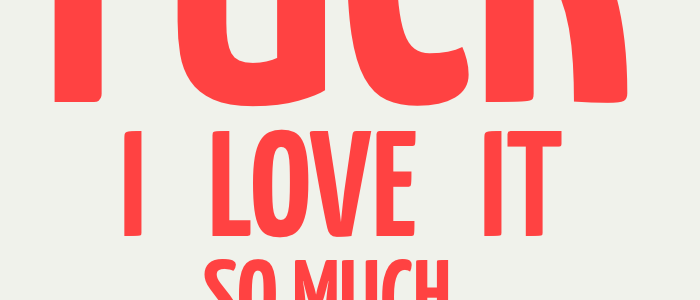
My slides are not designed for people who didn’t see the talk in person. They’re designed to support my words, not some online audience. What’s more, many commented that they found the design of the slides to be noteworthy. I’m expressly not a designer.
Working on your slide design pays off for the audience in front of you and for the audience online reading your slides later. I learned a lot designing this talk, and I think it can be helpful for you, too.
Colors

Color is the very first thing people will notice. It should also be the very first thing you think about.
Head to a color site like Colour Lovers and find a palette you like. Pick colors with a lot of contrast- it gives you a lot of flexibility with text, backgrounds, and objects. In my GitHub talk, I have around four colors I use frequently, and 8-10 total (lighter green to augment a darker green, lighter blue for my dark blue, and so on).
Size

Make your text huge. And then get rid of half of the words and make it huger. Almost all of the presentations I’ve ever seen at every conference screws this up.
Most of my text in my entire deck is at least 90pt. Usually I like to sit around 150pt, with spikes up to 300pt or more. You cannot get large enough.
For the curious, I use Yanone Kaffeesatz as the typeface for both my slide deck and the headings on my blog.
One of my favorite tweets from my New Orleans talk said “Great slide design- I was way in the back and could read every single word!” Forget the people in front of you: design for people three rooms away from you.
Words as Shapes

I took one design class in college. One of the most fascinating assignments they gave us was a study of shape: you get one letter, in one typeface… do something with it. The idea was that the severe limitation forced you to be creative with duplication, rotation, scale, alignment, and whitespace. It opened my mind to a lot of possibilities I hadn’t thought before. Letters themselves can be part of the design.
Slides give you the same opportunity. The easiest way to make your slides visually interesting is to play around with the physical shape of the letters that constitute the word. Line things up. Don’t line things up. Shift things around. Worry about pixels. Almost every single slide in my talk is a different font size, since I want things to work off of previous words, lines, and so on. Text sizes of 94.5 points are not uncommon in my deck. They create a much more interesting visual than throwing a random bullet point on-screen.
Repetition

Humans love repetition. It’s one of the tricks used in lots of disciplines. The best jazz soloists are capable of starting a melody, repeating it, and then playing with it after the audience has identified with the repetition. The best storytellers will repeat the same line throughout a story to build a sense of familiarity, of excitement. Slides are no different.
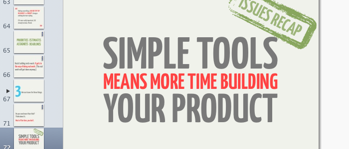
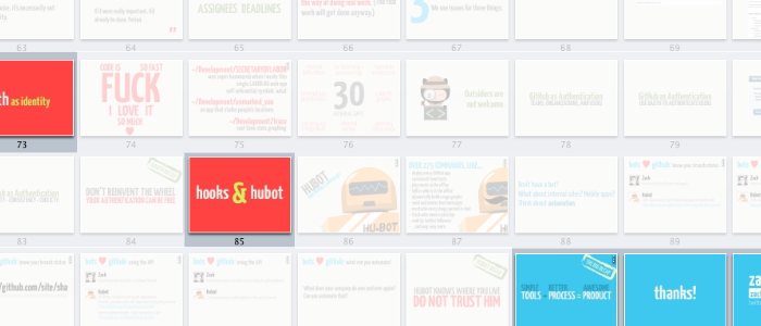
Steve Jobs did this often. Before moving onto the next product announcement, he’d spend thirty seconds and go over the same information he just presented. It’s a very simple way of keeping things memorable for your audience. I make this explicit by giving recap sections big green stamps in the upper corner saying “RECAP”. I also giving the start of each section of my talk bright orange backgrounds with colorful, bold text. Simple reiteration is important.
Simple reiteration is important.
Worry about it
A good set of slides won’t magically make your talk great. But a great talk is really hurt by terrible slides. Spend some time thinking about your slides. Put yourself in your audience’s shoes: is this readable? Is this interesting? Should I pay attention, or should I get my laptop out and hack until lunch?
I’m certainly not a designer, but it’s really remarkable how little design you need to put yourself far ahead of most talks. Huge text. Consistent colors. Less words. Worry about those, and it will already put you far ahead of the pack.